Services
CD
Concept Design
HMA Arquitectos
DD
Design Development
HMA Arquitectos
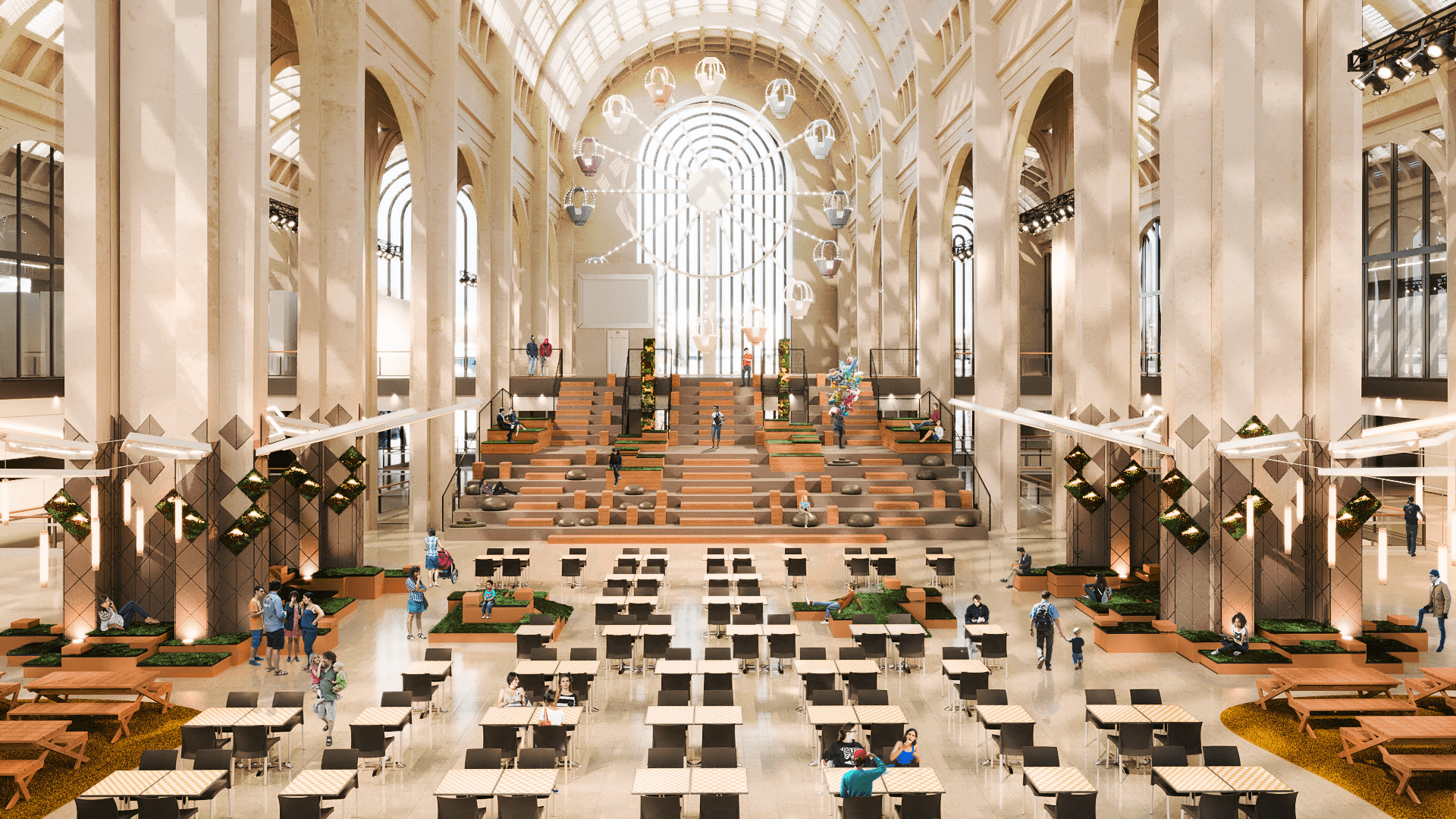
Abstract
Old Markets: We investigate the original morphologies of fairs and markets.
Agora: Origin of the polis and first market headquarters. Meeting point, place that summons to the meeting.
Landscape: Natural event. Interactivity space. Centre for eco-perceived sustainability.
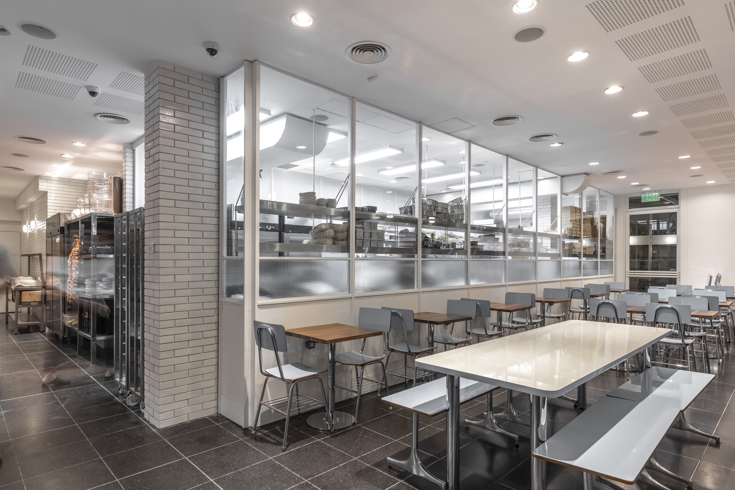
The proposal is based on the idea of recomposing the DNA of sustainable public space within the Shopping Mall, recreating green areas for recreation. Far from integrating a real nature, we emulate an intentionally orthogonal organic universe constituted as a topographic checkerboard.
We recreated a picnic environment, through the eco-perception of several of its elements as a design strategy. Its sustainable materials are part of the same concept.
We revindicate the spontaneous/deliberate congregation of mixed uses, typical of a contemporary city, as a unique and possible proposal to be implemented in today’s shopping malls. These we have divided into cells and denominated:
- Eco-wellness: Green areas recreated for use from the gastronomic (picnic).
- Recreation: Recreational spaces for leisure through topographical configurations.
- Connectivity: Areas prepared ergonomically and through specific furniture for remote work use. (networking)
- Market: Areas under the atriums ( tribunes ) for the use of commercial shops which are ideally complemented by the new use of the recreational areas.
These 4 (four) cells form a set of mixed uses and represent a dynamic, prepared to accommodate all types of audience.
Two large atriums I & II, work as viewpoints from which to view and be viewed, which cohabit and resolve recreational and gastronomic uses.
Abasto shopping centre has a long tradition, and we believe it is essential to build an independent identity, so that this space has a life of its own.


Recent Comments