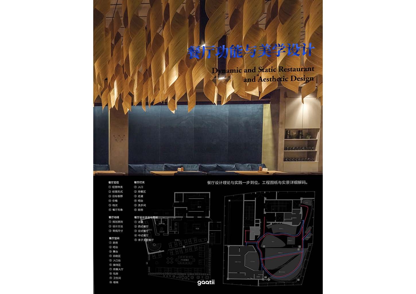
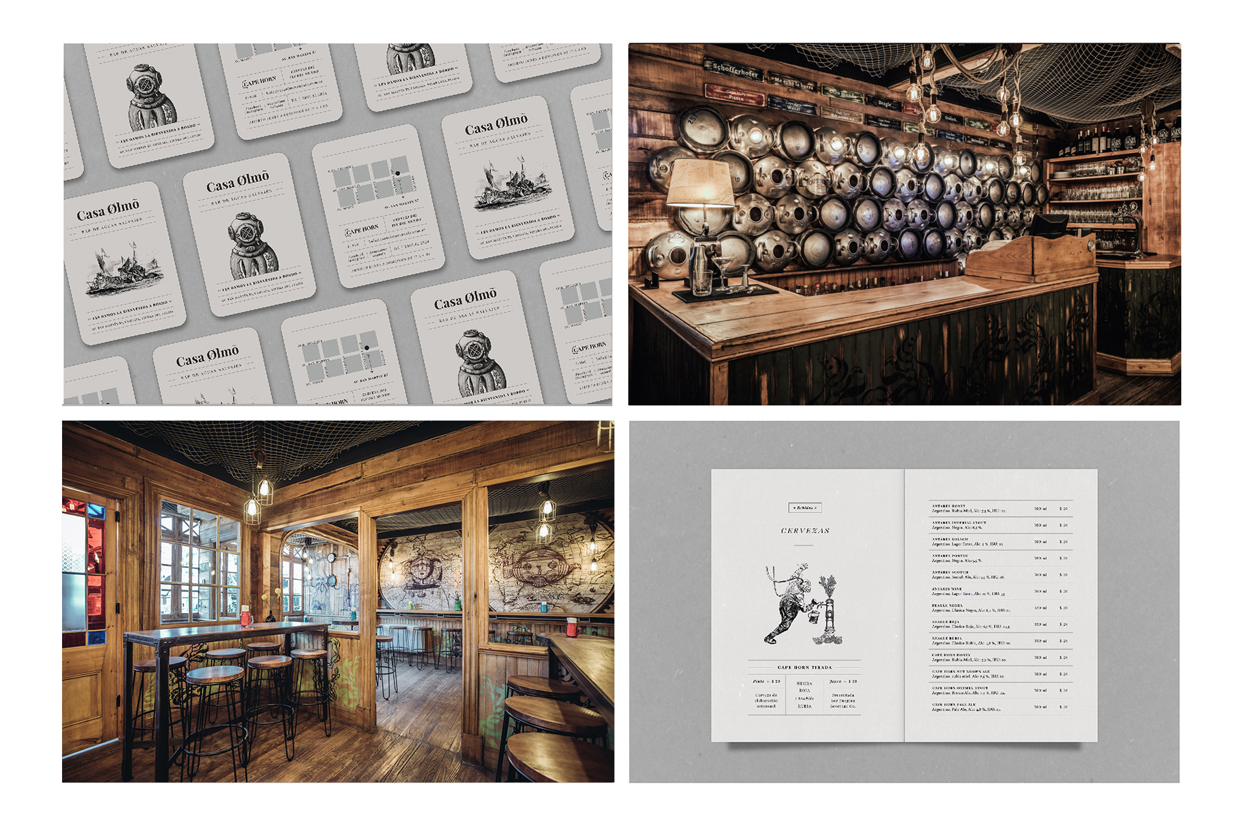
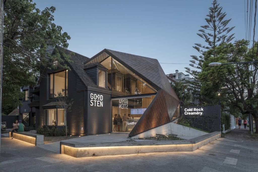
Cafe Artois

Services

CD

Concept Design & Art

HM Arquitectos

SD

Schematic design

HM Arquitectos

CD

Construction documents

HM Arquitectos

Abstract

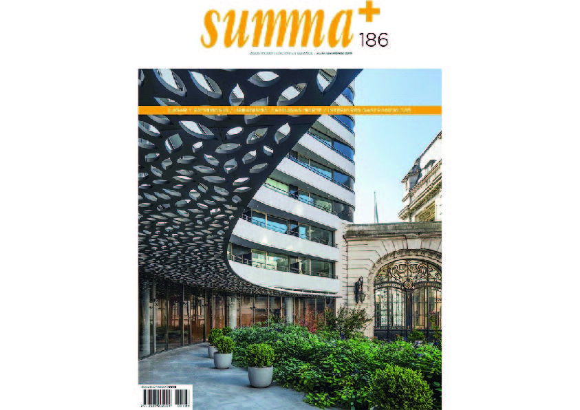
The project is located in an exclusive area of the city of Buenos Aires, within the area of the most important polo field in South America.

The project is the result of a two-factor investigation in related to the company that called us to the Stella Artois project, which we will describe as follows.

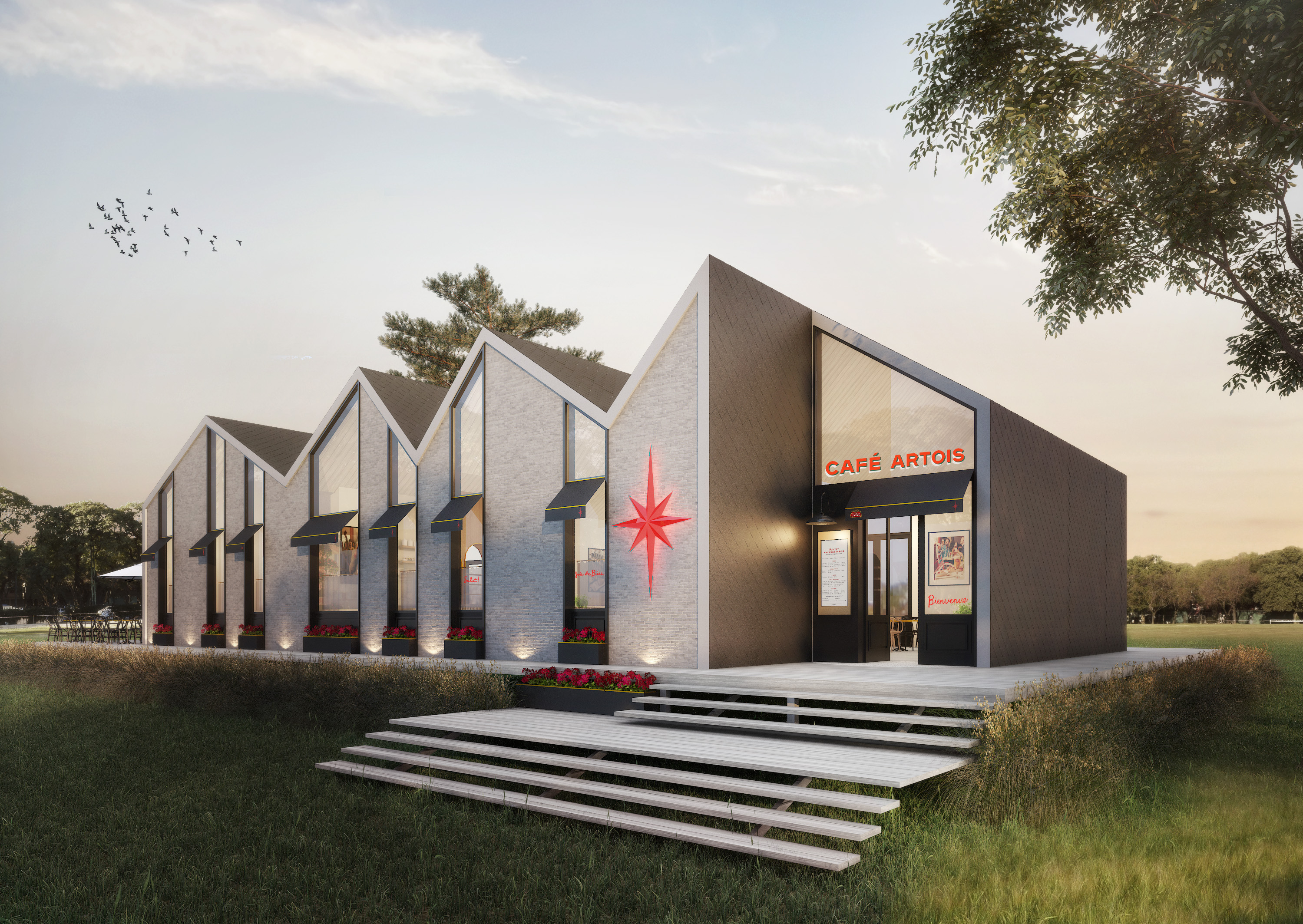
On the one hand, the building volume made us interested in refering it to the medieval constructive silhouettes that define the typical skyline of Bruges, which is very typical of Belgium, the country where the brand was born.

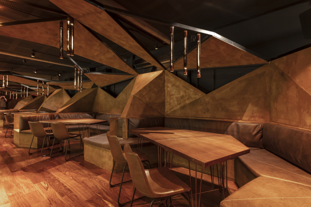
On the other hand, the interior work had to refer to the concept of the old typical European coffees of the beginning of the 20th century, very related to the Parisians style.

The challenge was to compose a volume inspired by these old buildings and their characteristic Belgian ceilings, but executing the figure under a contemporary vision, that is, modifying the slopes of the ceiling generating a dynamism and avoiding a regular volume generating a dynamism and avoiding a regular volume. It looks like the image of the typical buildings in front of the Dijver canal or the Bruges market.

The configuration of these ceilings forced us to understand that the windows had to dialogue in a contemporary way with that dynamism. On the other hand, in front of the building is located the polo field, and in the background the skyline of the city of Buenos Aires. The impact of these visuals was decisive in defining the dimension of the openings.

Constructively, we set up ornamented circular columns under the sloped ceilings, managing to mix an eclectic composition.

The interior organization is a typical two-level restaurant and all the visuals are directed to the polo field, hiding the services to the opposite sector.

The complex dialogue between an interior mostly represented under an image of a café of the early twentieth century, and the exterior of contemporary configuration, resulted in a complex eclectic balance of languages. This made it possible for our client to accept a contemporary image in spite of its clear inclination towards an old aesthetic.

Mamba Bar

Services

A

Activation

Oslo Creative

E

Strategy

Oslo Creative

D

Design

Oslo Creative
Mamba Bar

Mamba Bar

Services

CD

Concept Design & Art

HM Arquitectos

DD

Design development

HM Arquitectos

CD

Construction documents

HM Arquitectos

CA

Construction Administration

HM Arquitectos

ID

Interior design

HM Arquitectos

Abstract

The design has as starting point the culinary proposal based on a disruptive concept (based on the client´s words). We understood that the search was to exacerbate the senses, fuse flavors, evoque seductive aromas and create an attractive visual aesthetic.The idea was to promote the culinary proposl materialized through a dreamlike and suggestive landscpe that would accompany the great gastronomic challege. definitely inspired bythe name of the place, Mamba.

For this reason, te idea was to promote a large and unique piece capable of uniting the entire project, which would also be fully functional for the needs of the restaurant. It contains almost all usage features such as seating areas, DJ area, reception area, and your storefornt scenery. All througha landscape of abstract figures inspired by the scales of a large invertebate materlized in iron and covered with triangular MDF panels painted in marble ocide. This choice aims to mark a clear contemporary aesthetic line without falling into a pretentious space.

We have proposed conceptual elements in your showcase, in addition to two other corners, represented by broken and discarded crockery that offer an artistic image that adds to theimagination of your guests. It is a large showcase with a very suggestive artistic proposal, a kind of veil that covers the visibility of the restaurant, with the aim of seducing the visitor and calling him into mystery.

The presence of vegetation over the campfires is part of a balance of tones, and in the backyard, whose green landscape acts as a screen, it proposes an outdoor ecosystem for those who prefer to enjoy another atmosphere.

The Nim Bar

Services

A

Activation

The Brand Bean

E

Strategy

The Brand Bean

D

Design

The Brand Bean

Goodsten

Services

A

Activation

Estudio Nuar

E

Strategy

Estudio Nuar

D

Design

Estudio Nuar

The Nim Bar

Services

CD

Concept Design & Art

HM Architects

DD

Design development

HM Architects

CD

Construction documents

HM Architects

CA

Construction Management & Contract Administration

HM Architects

ID

Interior design

HM Architects

Abstract

From the outset, the project had to appeal to the aesthetic dissociation of the typical beer bar. The challenge was to create a new aesthetic universe associated to the cocktail bars but without forgetting the impressive brand of 30 taps, emphasizing the idea of the largest beer bar in Buenos Aires.

The conceptual idea incorporates elements distant to the reminiscences known by beer bars. In order to refresh this idea, it was extremely important to turn to an idea of conceptualization, where the starting point was the composition of plots based on a influence of traditional proto-rationalist American style mixed up with traditional Asian interior design elements.

The idea was composing two types of density of wooden meshes, closed and open, in oak tones that generate multiple depths. These are definitely veils and sieves that unravel mysteries between their interstices.


Its chess-like organization composes the closed meshes of the open ones.  Another material, but of the same compositional system, is the limestone in many of its walls. The communicative strategy on the façade proposes expressionism and a system similar to its interior.

As these are high-density materials and compositions, we´ve chosen contrast them with walls impaled with neutral patterns that allow a dialogue and not a competition between designs. The design of the wallpapers is associated with a universe of plant nature, and in accordance with this there are several sectors where we have the living presence of nature, as defined in the name of the line descent.

Two plant interventions define spatiality. On the one hand, the entrance on both sides as a method of pedestrian communication, and on the other hand the long “green tongue” hanged from the ceiling divided the large central dining area.

The organization on the top floor, divided into two sectors, shows its most distinctive side in its large living-room space. These are subdivided with movable panels that swing upwards to form a large and unique space covered by a ceiling of meshes according to convenience.

The communication from its logo and isotype emulates the same system formed by a plot and background whose nature is expressed through the phoenix bird.

Publication

/ Local & Global

Fuego & Birra

Services

A

Activation

Bongo estudio

E

Strategy

Bongo estudio

D

Design

Bongo estudio

Casa Olmo

Services

A

Activation

Estudio Nuar

E

Strategy

Estudio Nuar

D

Design

Estudio Nuar
Goodsten

Goodsten

Services

CD

Concept Design & Art

HM Architects

DD

Design development

HM Architects

CD

Construction documents

HM Architects

CA

Construction Administration

HM Architects

ID

Interior design

HM Architects

Abstract

GOODSTEN isn´t just a creamery. It is born from an experience of oneiric landscapes, as if it where form another world, with a completely different logic. Unknown and fantastic lands made us think of precious stones. Their faceted surfaces inspired us to create a construction system. Those rocks, which blind us with their glows and crystal-like textures, are diamonds from another world.

The allegory of the precious stone had an impact on creative decisions, both in design and construction aspects, branding decisions, and even on the making of the desserts, which are prepared on granite slabs with temperatures below zero.

We transformed this idea into a construction system, through a material which allowed us to mold these faceted figures, without falling into the literalness of stony materials. We wanted to express a homogeneity through one continuous surface of elements which set up a diamond-like shell, made possible by means of the repetition of treated metallic tiles.

The proposal is expressive and synthetic, in a way that it suggests an intriguing formalism from its silent and mono material condition. The construction of a double height annex, which grants the true spatiality to the creamery, is attached to the original house so that both coexist in a respectful and harmonic way. The new diamond-like structure dialogues morphologically with the pitched roofs of a 20th century chalet.

The site of the annex incorporates two mansards in the inside and a third one on the outside, which respond to the requirements of the ventilating and lighting municipal codes. Because of this, the roof considerably modifies its shape allowing the needed lighting and fresh air to enter. As a result, we found ourselves with a very plastic roof, geometrically speaking. At ground level we built a concrete piece, which works as a basement over which the roof rests, becoming one similar morphological configuration.

We created a compositional system of triangles and faceted surfaces which can be seen in various elements particularly designed. From the openings in the building in the production zone, to the annex roof allowing the light to be sifted. The same geometry, also makes up the metallic structure of the general lighting system, as well as the design of the exterior floorings, made from precast concrete. It all comes together to the same compositional criteria.

The general interior idea is determined by essentials from the aesthetic Nordic imaginary, as are the skin and leather tapestry, walls coated in natural wood and light-colored granites. All of these noble materials are used in a monochromatic way, so that a perfect integration of the oneiric and fantastic world and the compositional system created is generated with no greater difficulty.

The client´s requirements have been very rigorous. The surface destined to the production area covers almost 50% of the buildings total surface, divided in two levels and with two double circulations as to ensure the clearly differentiated public and private areas.

Publication

/ Local & Global